
Results: Plot Library
We have used plots as the primary means of reporting our research results. Most of the plots are accompanied by statistical information designed to help clarify the strength of the relationship between the two variables displayed. To see a plot in the table below, click on the plot number. Then click “Previous” or “Next” to move between plots sequentially. To return to the Plot Library table, use your browser Back button or close the plot window. Unless stated otherwise, all the plots shown are based on data from the interior of the specimen only; i.e., locations 2–5 indicated with blue arrows in figure 11. Any plot shown in gray type in the table below is planned but under development.
Plots appear in order of interest to the coauthors; our thoughts on what they reveal appear in the DISCUSSION section.
Inclusion of Error/Precision/Uncertainty in Plots
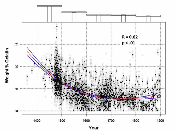
A simplified overview of our plotting work includes the following guidelines: (1) the black dots represent the observed data reported by the instrument, (2) the light gray circles indicate the range of error in the analysis method, (3) the red line shows the estimated mean as a function of year, and (4) the blue outer curves indicate the reliability of these mean estimates. In other words, with 95% confidence the actual means are between the two blue curves. Thus, in summary, to get a more reliable sense of the trend for the weight percent gelatin concentration over the centuries in figure 12, plot 1 (above), one should consider not only the red line, but the swath described by the space between the two blue outer curves. Even more telling are the tabletop graphics at the top of the plot that illustrate, by their relative heights, the change in mean values from century to century. If the tops appear at different heights, the changes can be considered statistically significant. The tabletop units coincide with the vertical axis units but their scale has been compressed for display purposes. It is important to point out that a statistically significant difference does not necessarily imply a significant practical difference. In other words, within certain mathematical parameters, we can have confidence an observed difference is not a chance occurrence; however, whether that difference has real-world implications is open to discussion.
A more detailed description of our plotting work follows below.
Sources of error, and uncertainty, and the degree of precision possible with different instruments are included in some but not all plots. For instance in plot 1 (above) the gelatin data (solid black symbols) are shown for the 1,578 specimens plotted over time. The vertical scale displays the predicted weight percent gelatin concentration. The tabletop display across the top of the graph depicts the mean levels across the centuries. The thickness of the tabletop gives the 95% confidence interval for the mean. Nonoverlapping tabletops imply that the difference between the means is statistically significant.
The red (center) curve represents a locally smoothed estimate of the mean, as a function of year. The blue (outer) curves give the pointwise 95% confidence intervals for the means over the years. We used LOESS (locally weighted scatter-plot smoothing) in R to compute the smoothed estimate of the mean. The confidence bands were derived using Monte Carlo simulation. The confidence bands account for the measurement error as described in the next paragraph.
The black points in the scatter plot represent the observed values. These observed values were measured with some error, so if we had carried out the same measurement procedures on the same samples, we would have come up with slightly different values. As discussed earlier, precision in our work was calculated differently for the XRF and the UV-Vis-NIR instrumentations. Using the respective precision parameters, corresponding to each observed datum (solid black symbol), we generated ten auxiliary data points (light gray circles) that represent data we would expect to see if the same measurement process was repeated ten times. The light gray circles represent potential values under replicate measurements. The spread of these potential values reflects the lack of precision in the measurements; i.e., the more spread out these potential values are, the less precision.
The statistic R is a generalization of the Pearson correlation coefficient. Whereas the correlation measures the strength of the linear relationship between X and Y, the statistic R measures the strength of the functional (linear or nonlinear) relationship between X and Y. If the observed (X, Y) values fall close to a smooth, nonconstant function of X, then R will take on a value close to 1. If X and Y are linearly related, then R will be numerically identical to the absolute value of the correlation coefficient. Numerically, R is the correlation between the smoothed estimates of the Y means and the observed Y values. As mentioned above, we used the function LOESS in R to compute the smoothed estimates of the Y means, and the P value was computed using a nonparametric bootstrap approach.
Plot Library Table
*Plot numbers with asterisks have error incorporated; all other plots are based on “observed” data. Units for elements (Ca, K, S, and Fe or Log Ca, Log K, Log S, and Log Fe) are displayed in parts per million (ppm).
PLOT CLASS, NUMBER |
VARIABLE 1 versus |
VARIABLE 2 |
COMMENTS |
|---|---|---|---|
CHRONOLOGICAL |
|||
FULL DATA SET |
|||
1* |
Gelatin |
Year |
|
2* |
Log Ca |
Year |
The natural log transformation was used to compresses the spread of high and low values by reducing the amount of skew leaving patterns in the data more clearly visible. |
Log K |
Year |
ditto |
|
Log S |
Year |
ditto |
|
Log Fe |
Year |
ditto |
|
Log S |
Log K |
by century |
|
Thickness one sheet |
Year |
||
Thickness ten sheets |
Year |
||
Delta L* |
Year |
The delta L* vertical scale progresses from 0 (white) toward -30 (colors increasingly closer to black) |
|
Chlorine (Cl) peak intensity |
Year |
Cl was not in the calibration so reported values in this plot indicate Cl peak height intensity rather than ppm |
|
Calcium Carbonate |
Year |
Based on all observed Ca = calcium carbonate |
|
Log CaCO3 |
Year |
Based on all observed Ca = calcium carbonate |
|
Ratio gelatin:CaCO3 |
Year |
Based on all observed Ca = calcium carbonate |
|
Ratio gelatin:CaCO3, zoom 1 |
Year |
Based on all observed Ca = calcium carbonate |
|
Ratio gelatin:CaCO3, zoom 2 |
Year |
Based on all observed Ca = calcium carbonate |
|
Calcium (ppm) |
Year |
||
Alum |
Year |
Based on all observed S = potassium aluminum sulfate prior to 1800, aluminum sulfate post 1800 |
|
Potash alum K |
Year |
Based on all observed K = potassium aluminum sulfate prior to 1800 only |
|
Log potash alum |
Year |
ditto |
|
Potash alum S |
Year |
Based on all observed S = potassium aluminum sulfate prior to 1800 |
|
% alum on gelatin |
Year |
Based on all observed S = potassium aluminum sulfate prior to 1800, aluminum sulfate post 1800 |
|
% alum on gelatin, zoom |
Year |
Based on all observed S = potassium aluminum sulfate prior to 1800, aluminum sulfate post 1800 |
|
% alum on CaCO3 |
Year |
ditto |
|
% alum on CaCO3 , zoom |
Year |
ditto |
|
LEAF TYPES |
|||
Log Ca |
Year by leaf type |
All leaf types |
|
Log Ca |
Year by leaf type |
Art prints, blank leaves, MS books, MS leaves |
|
Log Ca |
Year by leaf type |
Printed leaves, printed books |
|
Ca (ppm) |
Year by leaf type |
All leaf types |
|
Ca (ppm) |
Count by leaf type |
Bar graph |
|
Log K |
Year by leaf type |
All leaf types |
|
K (ppm) |
Count by leaf type |
Bar graph |
|
Log S |
Year by leaf type |
All leaf types |
|
S (ppm) |
Count by leaf type |
Bar graph |
|
Log Fe |
Year by leaf type |
All leaf types |
|
Fe (ppm) |
Count by leaf type |
Bar graph |
|
Gelatin |
Year by leaf type |
All leaf types |
|
Gelatin |
Year by leaf type |
Art prints, blank leaves, MS books, MS leaves |
|
Gelatin |
Year by leaf type |
Printed leaves, printed books |
|
Gelatin |
Year by leaf type |
Printed books |
|
Gelatin |
Year by leaf type |
Printed leaves |
|
Gelatin |
Count by leaf type |
Bar graph |
|
NON-CHRONOLOGICAL |
|||
FULL DATA SET |
|||
Gel |
Delta L* |
The delta L* vertical scale progresses from 0 (white) toward -30 (colors increasingly closer to black) |
|
Log Ca |
Delta L* |
ditto |
|
Log K |
Delta L* |
ditto |
|
Log S |
Delta L* |
ditto |
|
Fe |
Delta L* |
ditto |
|
Delta L* |
% alum on gelatin |
ditto |
|
Delta L* |
% alum on CaCO3 |
ditto |
|
Gel |
Delta a* |
The delta a* scale indicates more red as the positive numbers increase, more green as negative numbers decrease. |
|
Log Ca |
Delta a* |
ditto |
|
Log K |
Delta a* |
ditto |
|
Log S |
Delta a* |
ditto |
|
Fe |
Delta a* |
ditto |
|
Delta a* |
% alum on gelatin |
ditto |
|
Delta a* |
% alum on CaCO3 |
ditto |
|
Gelatin interior |
Gelatin edge |
||
Ca interior |
Ca edge |
||
Fe interior |
Fe edge |
||
S interior |
S edge |
||
Log Ca |
Gelatin |
||
"ORNAMENT" PLOTS |
|||
FULL DATA SET |
|||
Gelatin |
M&W (materials and workmanship) |
Ornament plot showing the average estimated concentrations for M&W grade 1 (worst) to grade 5 (best). |
|
Log Ca |
M&W |
ditto |
|
Log K |
M&W |
ditto |
|
Log S |
M&W |
ditto |
|
Log Fe |
M&W |
ditto |
|
Thickness 1 sheet |
M&W |
ditto |
|
Delta L* |
M&W |
ditto |
|
300 DARKEST vs 300 LIGHTEST SUBSET |
300 darkest and lightest specimens from the full 1,578-specimen data set. |
||
300 darkest & 300 lightest |
Delta L* |
||
300 D & 300 L |
Year |
Plot shows distribution of specimens by year. |
|
300 D & 300 L |
Gelatin |
||
300 D & 300 L |
Log Ca |
||
300 D & 300 L |
Log K |
||
300 D & 300 L |
Log S |
||
300 D & 300 L |
Log Fe |
||
300 D & 300 L |
Thickness 1 sheet |
ditto |
|
FROST = GRADE A SUBSET |
295 specimens graded "A" for "aqueous intervention unlikely" by conservator G. Frost. |
||
50% darkest & 50% lightest |
Delta L* |
||
50% D & 50% L |
Year |
Plot shows distribution of specimens by year. |
|
50% D & 50% L |
Gelatin |
||
50% D & 50% L |
Log Ca |
||
50% D & 50% L |
Log K |
||
50% D & 50% L |
Log S |
||
50% D & 50% L |
Log Fe |
||
50% D & 50% L |
Thickness 1 sheet |
||
"SAME BOOK DIFFERENT PAPERS SUBSET" |
|||
Delta L* |
Gelatin |
Trends evident in paired specimens in the same book: one darker, one lighter. |
|
Delta L* |
Log Ca |
ditto |
|
Delta L* |
Log K |
ditto |
|
Delta L* |
Log S |
ditto |
|
Delta L* |
Fe |
ditto |
|
82 |
Delta L* |
% alum on gelatin |
ditto |
83 |
Delta L* |
% alum on CaCO3 |
ditto |
84 |
Delta a* |
Gelatin |
ditto |
85 |
Delta a* |
Log Ca |
ditto |
86 |
Delta a* |
Log K |
ditto |
87 |
Delta a* |
Log S |
ditto |
88 |
Delta a* |
Log Fe [or Fe] |
ditto |
89 |
Delta a* |
% alum on gelatin |
ditto |
90 |
Delta a* |
% alum on CaCO3 |
ditto |